Also too many reaction options start feeling gimmicky and add clutter to how a page is displayed.
that isnt negative
definitely not more negative than ![]()
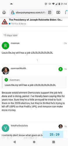
Any reason the site on my phone looks like this now (Like button, reply, etc all gone)?
It wasn’t like this yesterday and doesn’t look like this on UP.
Is that the default light theme? And you’re logged in?
I don’t see the same behavior on my phone in Chrome, even after switching to light theme ![]() maybe clear browser cookies/cache for this site? Or changing to a different theme to see if you still have the problem, then back?
maybe clear browser cookies/cache for this site? Or changing to a different theme to see if you still have the problem, then back?
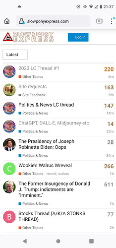
Definitely not a theme problem. And this is what it looked like after I cleared the cookies from the site:
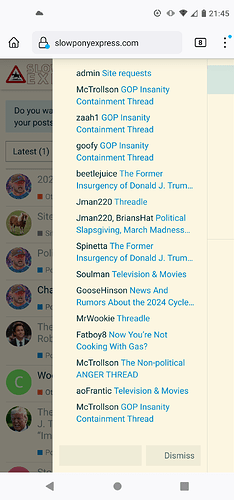
And this is what it looks like after I log in when I click my avatar in the top right:
It’s like every icon-like thing has disappeared.
Hmm, still puzzled. Do you have any other browsers on your phone you can try to see if they exhibit the same problem?
I think the stuff you’re seeing load improperly are generally SVGs, which is…weird, like I don’t know why those in particular would stop working.
What’s the cloud icon in the upper left?
Just went on Chrome and did not see that problem. I guess that’s a workaround, but would rather keep using Firefox, as I use it for everything else.
A weather alert for possible -40 wind chills Friday night.
I also have weird behavior here on mobile Firefox that I don’t really understand (the site takes forever to load sometimes, only on mobile FF, not desktop FF or mobile Chrome), which seems like an unrelated issue to your really weird behavior.
![]() yikes! I thought it might be a VPN app or something and was wondering if it might cause connection problems, but that sounds worse.
yikes! I thought it might be a VPN app or something and was wondering if it might cause connection problems, but that sounds worse.
has to be software related. have there been changes to trust levels?
Sorry if this has been discussed.
But really. 2 clicks to give a post a heart?
Why?
Did you notice the other, non-standard options for reacting to posts, in addition to the basic heart? More choices means more clicks, unfortunately.
(I could imagine an interface where two clicks wasn’t needed but it would take up more space and require some development effort.)
it’s one click for me in chrome and safari
For me the behavior is reasonable:
on mobile (safari on ios): if you tap the heart, you just get a heart. if you touch and hold, the menu for other reactions pops up and you can pick from that
on desktop (firefox on macos): hovering over the heart pops up the menu, and you can either just click on the original heart to get the heart, or pick something from the popup
cliffs: 1-click heart on both mobile and desktop
Yes, you guys are both right that it’s one actual click, but what I should have been more precise about was that it’s two “actions”: first is the “touch and hold” or “hover” (depending on mobile or desktop), second is the tap or click to select the reaction.
To have a true “one-action” selection process, I think all of the options would have to be visible and then toggle/select when tapped/clicked.
To be clear, I also think the existing setup is fine – having the extra options is worth the extra interaction to me.
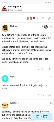
It’s 2 actions if you want one of the alternate reactions, but I guess my point was it’s truly only 1 action (for me) if I just want the basic heart.
Maybe there’s some browser dependency but @Rugby’s original comment of “two clicks to give a post a heart” isn’t true for me.
Eta: sorry, I think we are on the same page, don’t mean to beat a dead horse.
I stand corrected. A quick click gets me just a heart.
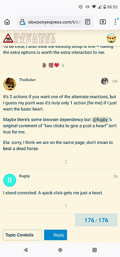
Strangely, I see the hearts on my mobile Firefox, but only if the person has also received a specialty reaction. If it’s just hearts, it’s invisible.
That’s a strange one. When I look at the site with Firefox on my phone I see what I’m supposed to see:
It seems like the problem could be on your end? What does the site look like if you visit in a private window/tab?
You could also try signing out and signing back in, or clearing Firefox’s cache, either within Firefox or at the OS level. (What OS and device are you using? For reference, I’m on a Samsung Galaxy S21 with Android 13.)
I don’t doubt that.
I tried signing out and clearing the cache from slowponyexpress yesterday to no success. I’m on a Motorola somethingorother.
Actually it looks perfect if I do that. Huh.
I’m kinda stumped now. I noticed that one difference between our screenshots was that you were using a different theme (I think Solarized Light, I was using default Light). But I tried switching myself to that theme and looking at it in Firefox dev tools mobile emulation mode and the hearts and reactions showed up as expected. I suppose there could be some difference between a real mobile device and the emulation mode, but I’ve never seen something that egregious.
Can I assume your Firefox app on your phone is up to date? Otherwise, I still think it might have something to do with caching. I always have a hell of a time getting mobile browsers to actually reload everything… Sorry I can’t be more helpful.
